Magicboosting
Climb in Valorant with a service that looks and feels as premium as the game itself – clear pricing, live progress, and interfaces designed to remove friction instead of adding more doubt.
role
Product & UI/UX Designer
Resposibilities
End to end product design
Industry
Gaming, Esports
Tools
Figma

Chapter 1
Problem
The Valorant boosting market is crowded with services that feel risky, opaque, and often untrustworthy. Most websites look like quick templates: overloaded with text, mismatched visuals, and no clear sense of who is actually behind the boost. At the same time, players still want to progress quickly without investing hundreds of hours into ranked.
The UX challenge was to design an experience that visually feels like an extension of the Valorant universe while communicating reliability and control – turning boosting from something that happens in the shadows into a service you can comfortably show on your screen.
A content hub built to answer real player questions and drive organic traffic through tailored Valorant and ranked‑climbing articles.
Chapter 2
UX Architecture
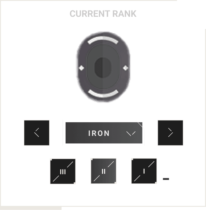
The experience is structured around a simple three-step journey that mirrors what you see in the interface: choose your current and desired rank in the main rank cards, configure details with focused option blocks, and then move into a dedicated tracking view.
Each screen is visually scoped to a single decision and supported by contextual hints, so even first‑time users understand how ETA, price, and level of comfort (duo, stream, offline) change based on their choices.


Chapter 3
Visual Language
The visual language combines the energy of competitive Valorant with the restraint of a booking platform. Card‑based layouts, clean typography, and focused color accents let the new visuals breathe while still clearly separating primary actions from supporting information.
Chapter 4
Interaction Design
The interaction design leans heavily on familiar patterns from gaming and dashboards: sliders, segmented controls, and progress cards that match the new visuals. Rank selection, order summary, and progress tracking all use the same visual language so the user never has to mentally “re-learn” the interface.
Subtle motion and hover states highlight where it is safe to click, while the dark cards with bold typography frame the most important information – current rank, target, order state – exactly where the eye naturally lands.
